


Florie Frivolité
création de logo


Floriane is a craftswoman. She makes jewelry from lace tatting, an ancient and little-known craft also known as Frivolité. She wanted her logo to reflect her values and personality.
The value of crafts • Benevolence • Gentleness • Harmony
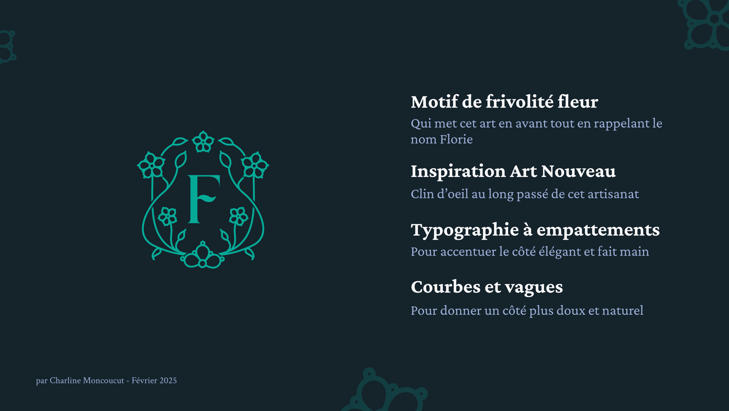


To represent her art, I chose to feature a motif of a stylized Frivolité. I drew inspiration from the visuals and ornamentation of the early 20th century, which, with their imperfect quality, lend a handmade, old-fashioned feel to Frivolité. The logo is composed of an emblem with a capital F at its center, in a serif typography, again as a nod to the handmade and to history in general. The emblem can stand alone, or be accompanied by the text, which mixes capital letters to give the name impact, with lower-case curlicues to recall the basic technique of frivolity and balance the impact of capital letters with softness.
Curves and soft shapes echo the values of benevolence and gentleness, and symmetry echoes harmony. And the floral motifs represent the name Florie.
Of the 3 proposals I gave her, Florie chose this one because she saw in it a slightly hidden meaning, which is very personal to her and reinforces her connection to this logo.
Do you like what I do?
Send me a message to talk about a project, or simply to chat!


Follow me there: