

My visual identity, and progress on the website
Sum up of the progress on my visual identity, and on the website.
JOURNAL DE BORD
The cobblers are the worst shod, as they say. And it's true that it's much more complicated to work for yourself than for someone else. But I think I've got my visual identity just about right.
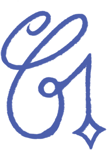
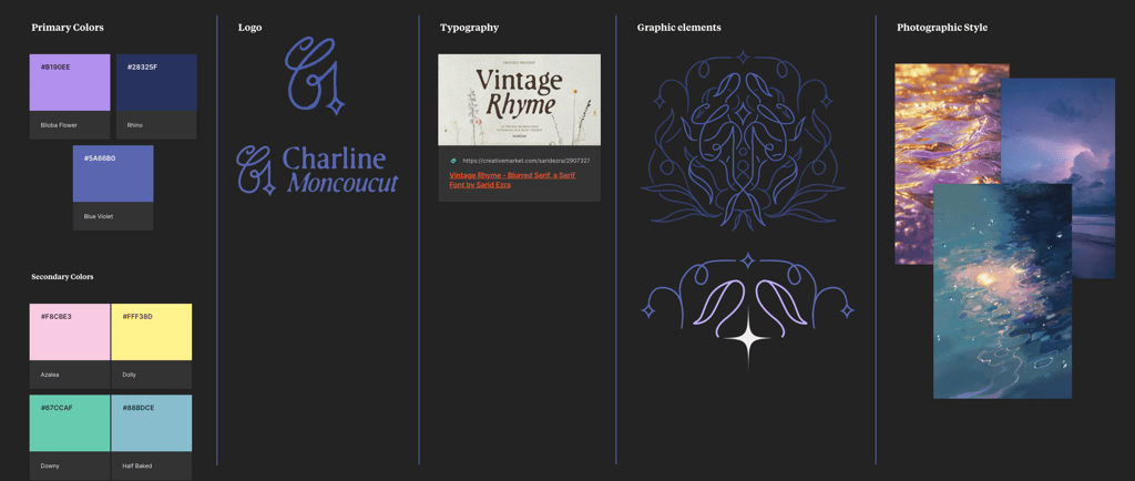
The “logo” is actually based on my usual initials, which I've made cleaner and more refined, and to which I've added a little star. Why a star? Because it's a symbol that's always been present in my drawings and doodles. And because when I pick up a tarot deck and ask it to show me which card represents me, 9 times out of 10 it's the stars that come up. Coincidence? It's also the card that symbolizes my astrological sign. It represents creativity, renewal, hope and artistic aspirations.
The colour palette is drawn from a multitude of images I love, representing moments and places that inspire me and give me a sense of calm and serenity. You could sum it up as “February sunrise” or “Nightfall on the water”.
For the typography I chose Vintage Rhyme, a slightly distressed lettering that gives a sense of familiarity and comfort, while being elegant and rather refined.
I then had some fun creating quick compositions in my usual style, starting with my initials and the star.
And finally, I applied all this to the site you're on right now! What do you think of it? What vibes does it give off?
Follow me there: